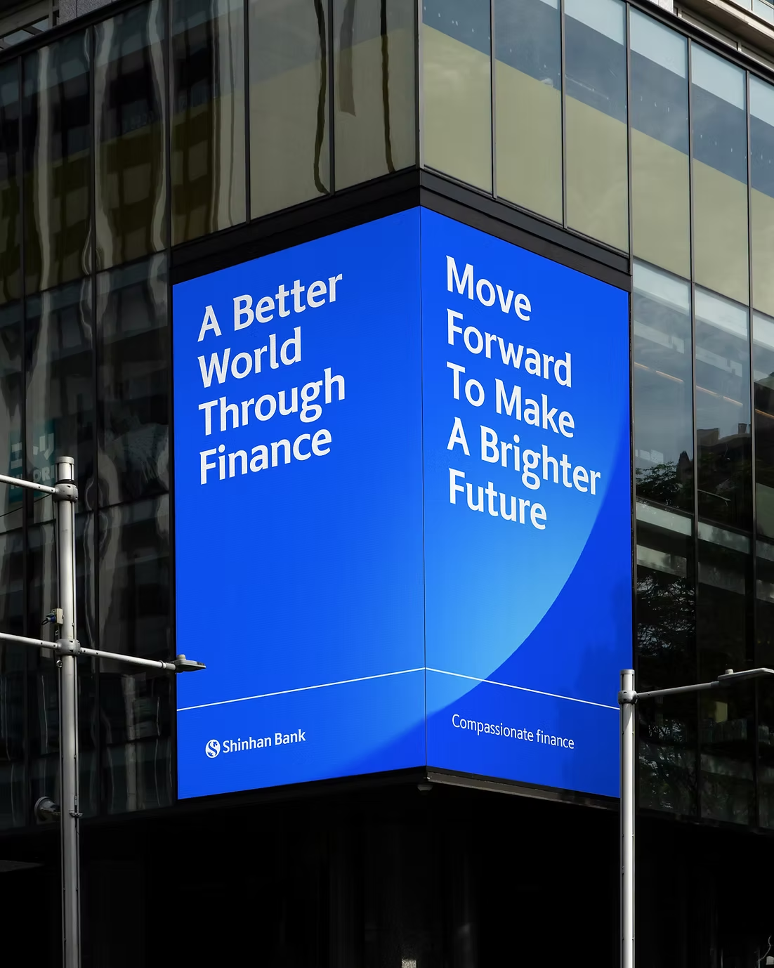
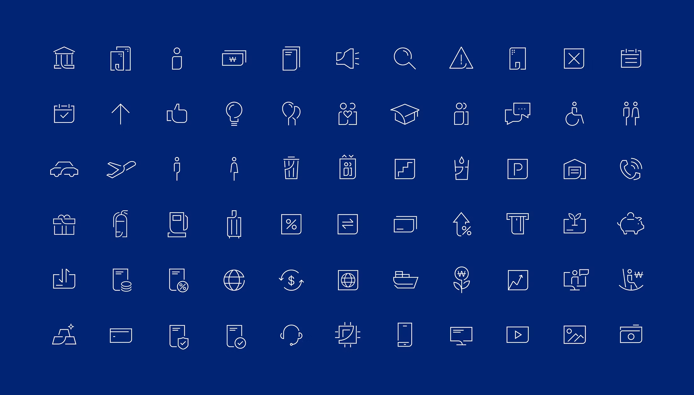
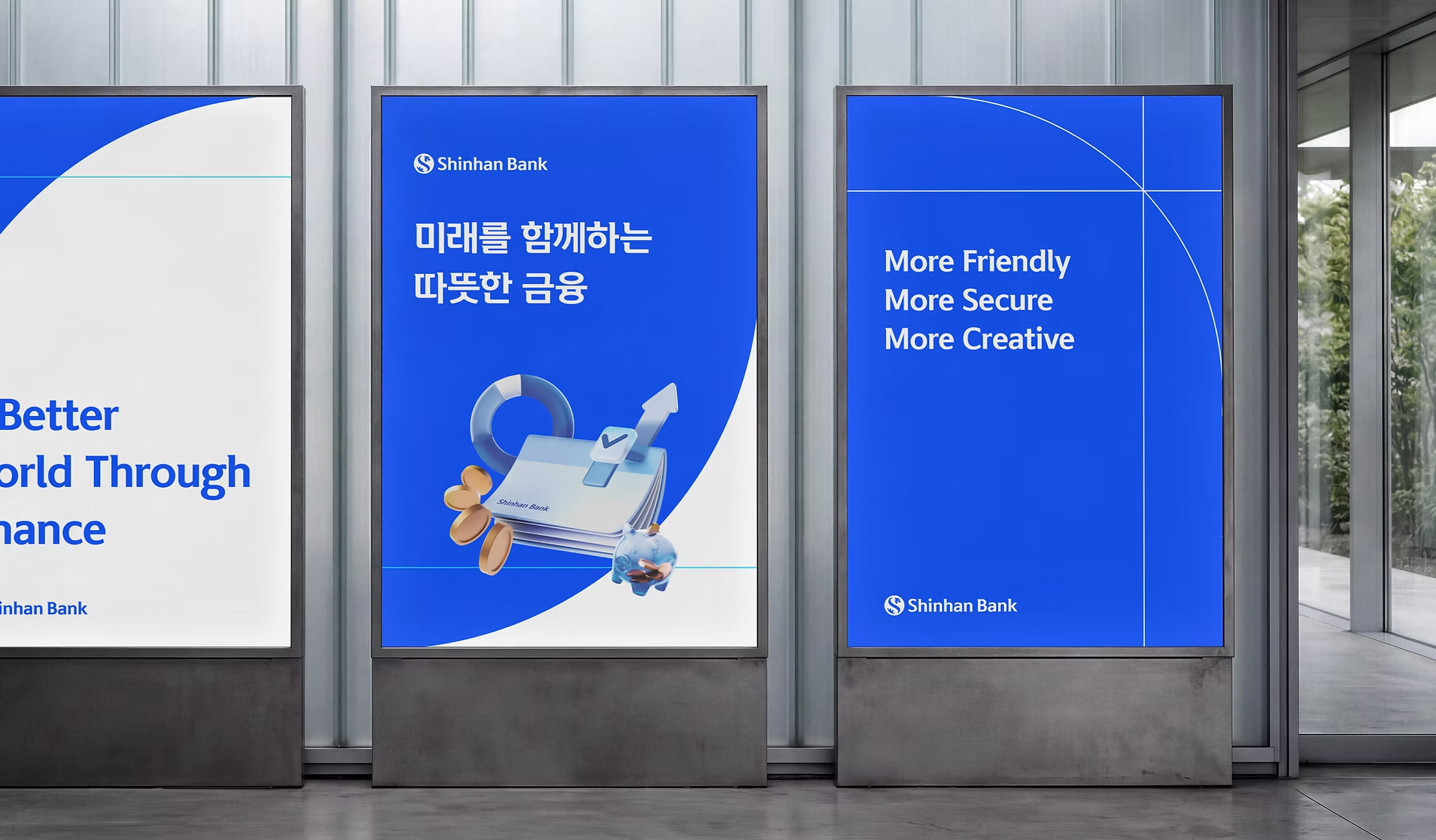
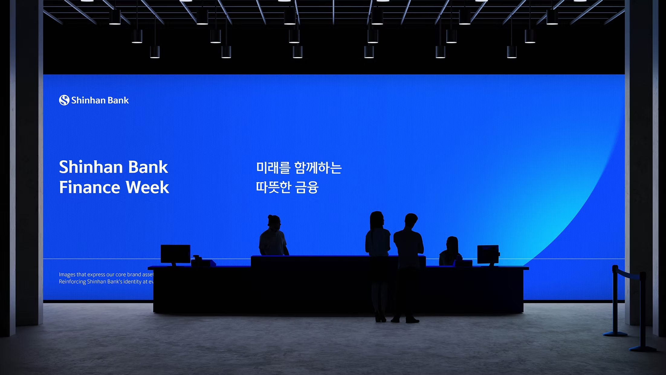
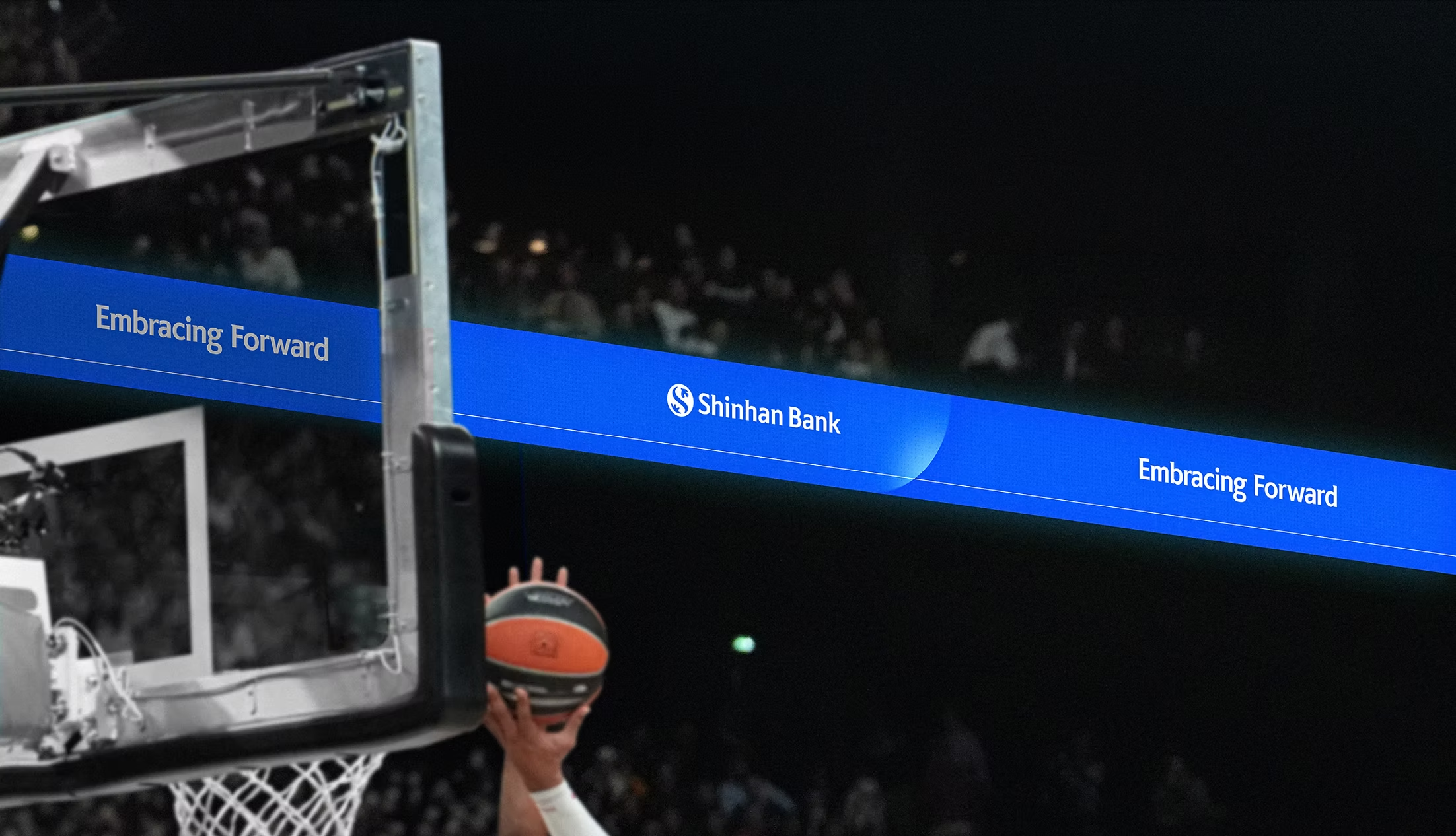
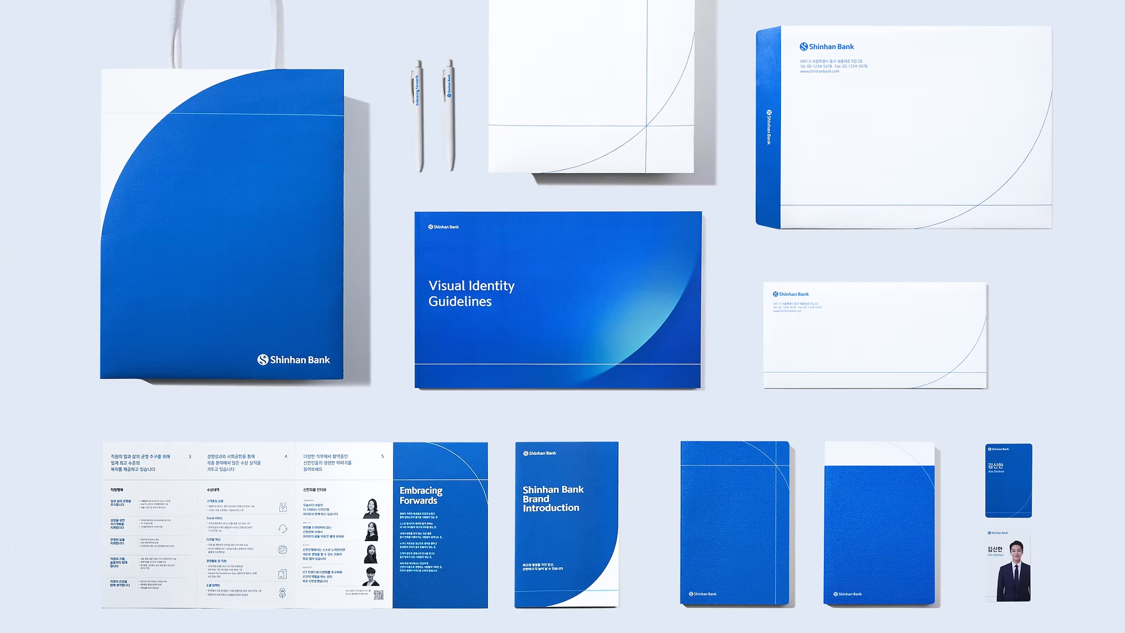
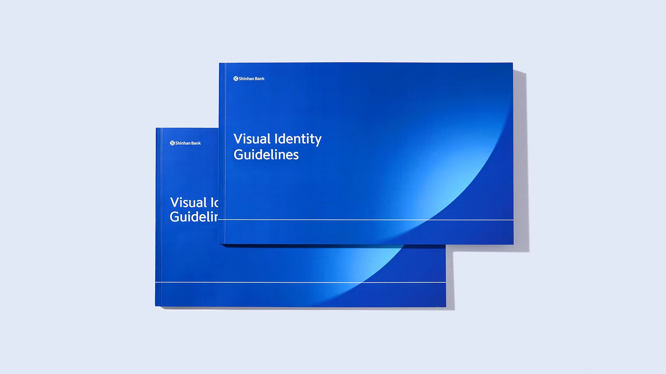
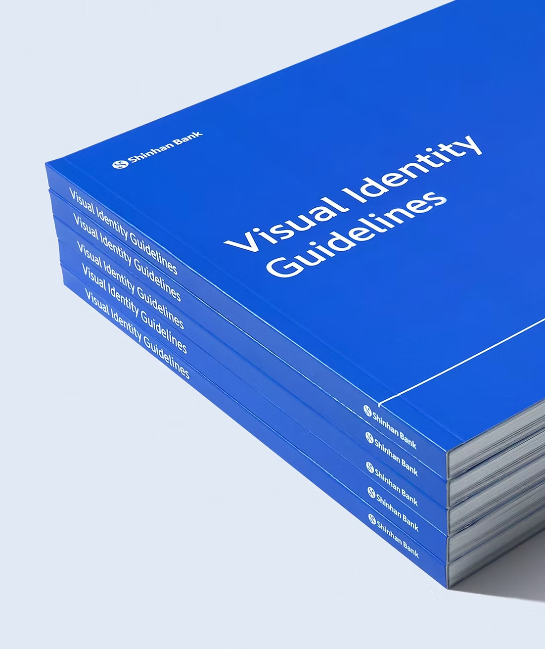
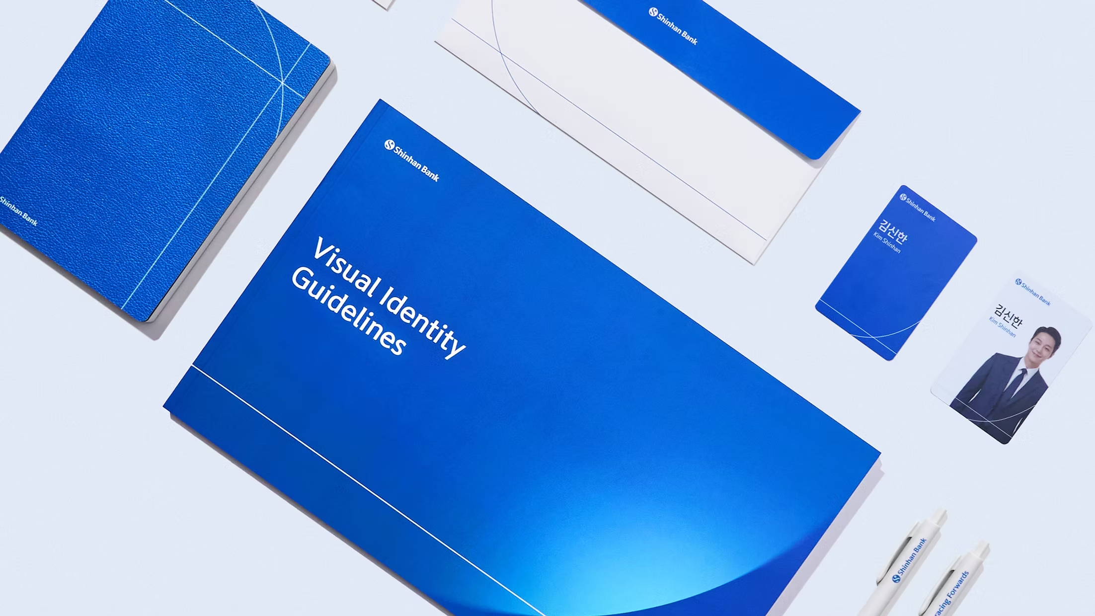
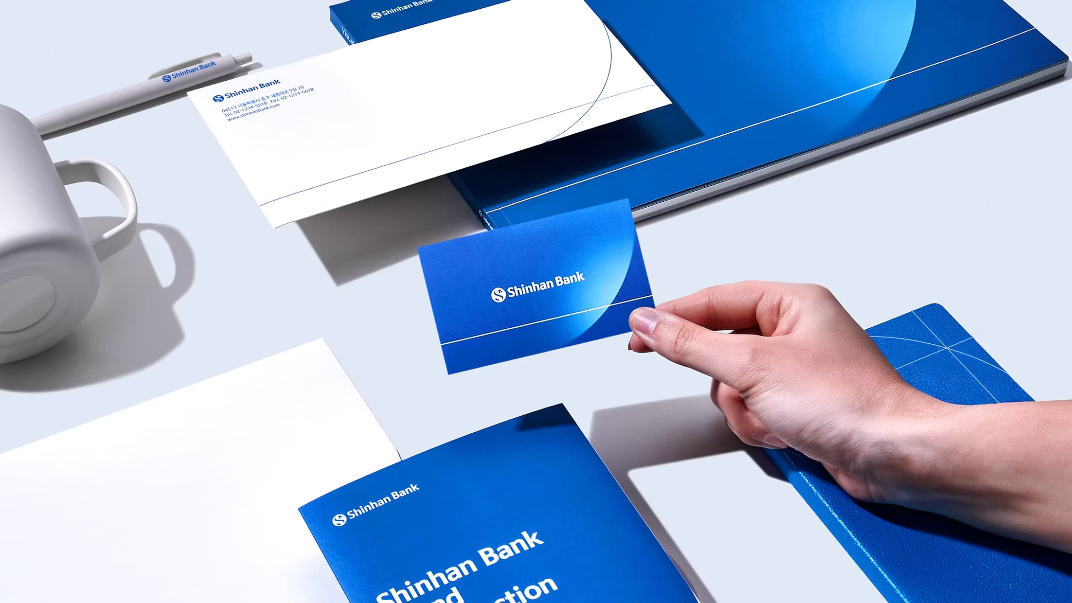
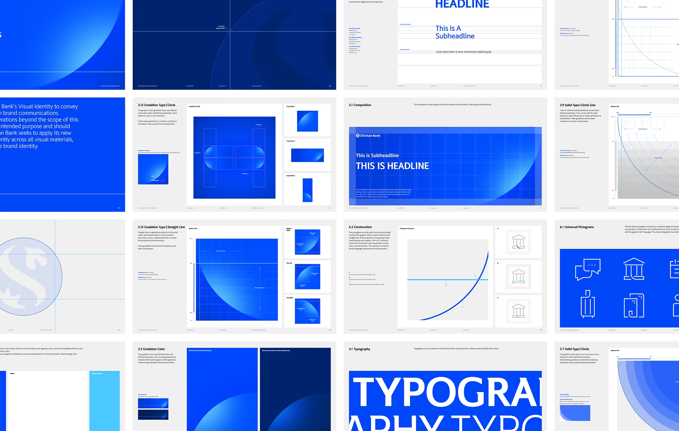
Shinhan Bank’s new Visual Identity was developed as an integrated and scalable system that reflects the brand’s philosophy and values while ensuring consistency across diverse customer touchpoints. Built around the concept of “Embracing Forward,” it expresses a future-oriented and inclusive vision of finance through a unified visual framework spanning both digital and physical environments.
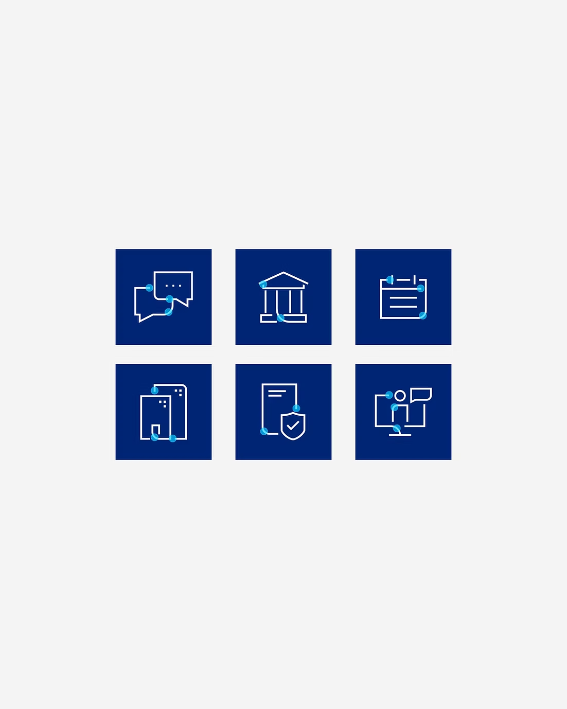
The system is based on a graphic language derived from Shinhan Bank’s circular symbol, representing connection, growth, and value creation. Expanded into three visual forms—Line, Solid, and Gradient—it provides flexibility across a wide range of communication channels.
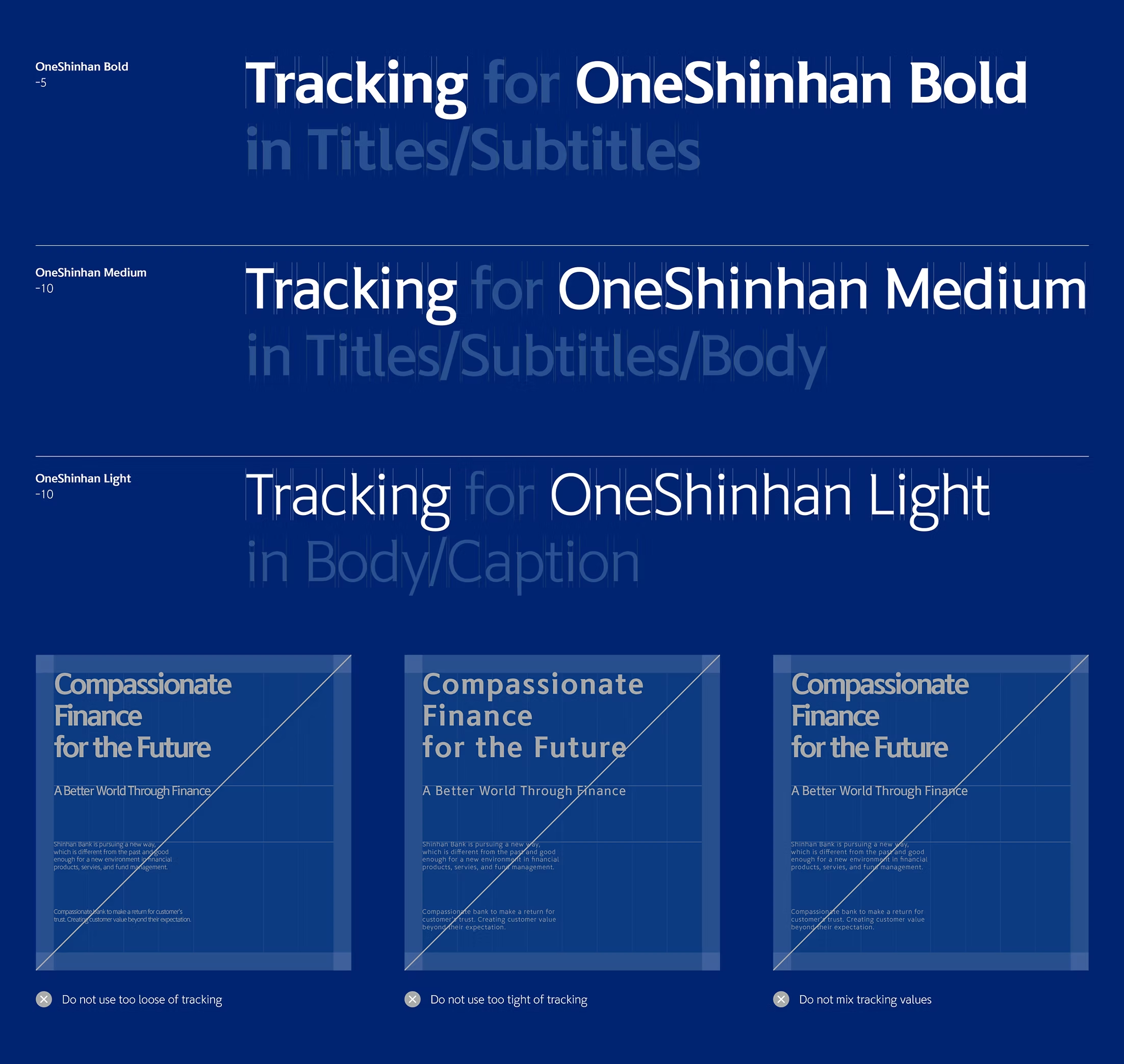
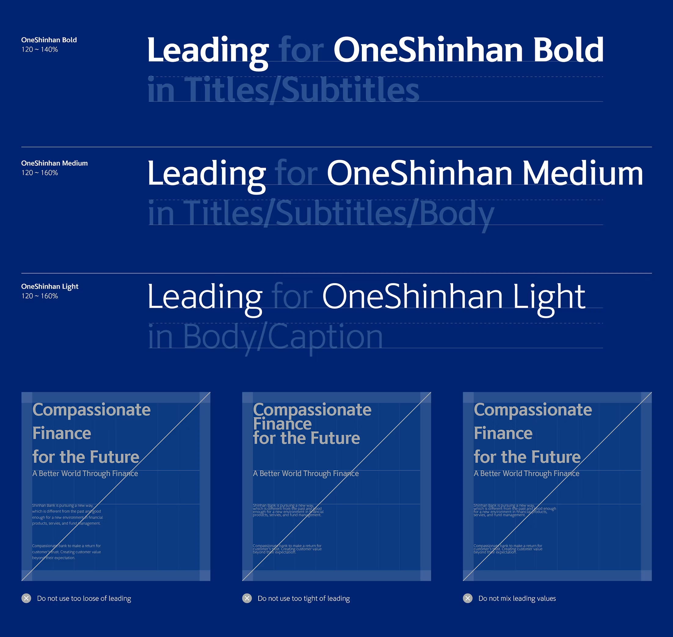
To address the rapid diversification of financial touchpoints, the renewal also redefined Shinhan Bank’s signature color palette and typography. Together, these elements strengthen visual consistency and deliver a modern, cohesive brand experience.